How to create an effective pitch deck
By Rolando Gómez
If you’re a feature screenwriter, at some point you’ll be asked for a pitch deck to help sell your script to the film industry executives that count – the ones who approve the signed checks but rarely read scripts. When this happens, you’ll have one of two options: pay someone to create a pitch deck, which often costs considerably more than script coverage, or create one yourself. So let’s discuss option two.
Pitch decks defined
Before you can create an effective pitch deck, you must understand their purpose and how they work their magic.
A pitch deck is a well-designed presentation that introduces the viewer to your film ie your storyline or story idea, and what makes your feature film special – in essence, it’s a sales pitch visual aid, like an effective PowerPoint business presentation. At a minimum, a pitch deck should include the following in 10 slides or less, five being the bare minimum:
title page
logline
synopsis
importance of film
genre
protagonist arc
nutshell (comparisons)
theme
tone
similar films (themes)
about the writer
closing
You can also include any attached filmmakers and talent, a distribution strategy, and a budget, but the latter two are more reserved for producers’ pitch decks than writers – so you’ll want to make your pitch decks editable. We’ll show you how below.
Pitch deck tools
Your pitch deck will contain text and – just like a feature script – it needs to be free of spelling and grammatical errors. Use a word processing app like MS Word or Pages to create your outline of your pitch deck and then it’s easy to copy and paste text into your pitch deck slides that you can make in Adobe Photoshop – or any image editing program, but we’ll stick with Photoshop for the purpose of this article.
Why Photoshop? Because a pitch deck may need future edits and Photoshop .psd files are easy to edit, plus they allow you to create a high-resolution pitch deck perfect for printing and a low-resolution version to share online, on your laptop tablet, television screen, or via email.
Pitch deck parameters
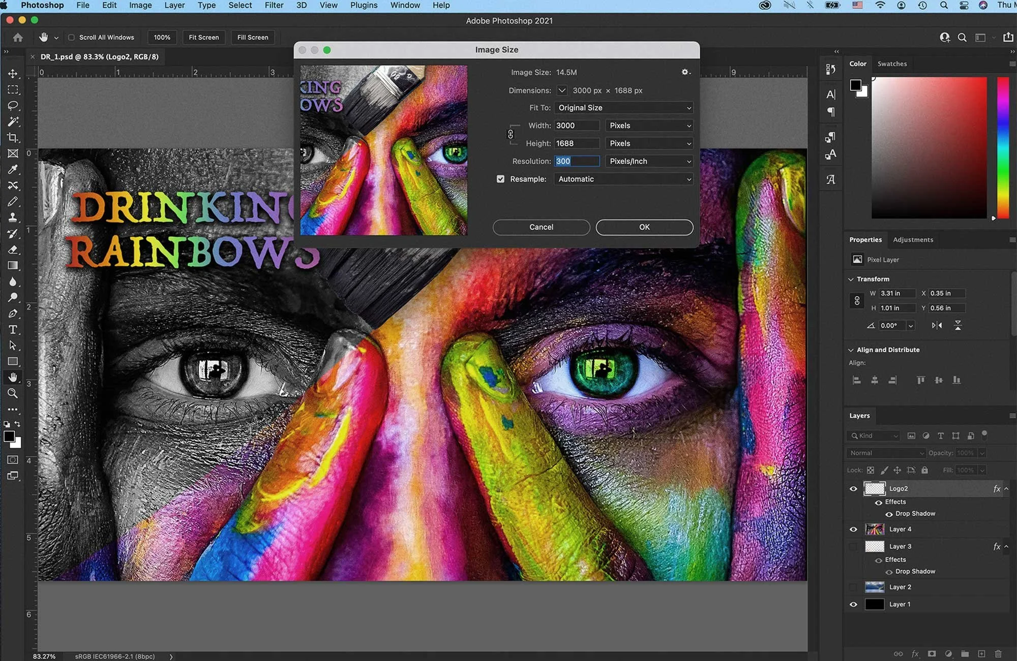
The ideal size in Photoshop for your pitch deck .psd files are 3000 pixels wide, 1688 pixels high, and a 300 pixels per inch resolution setting. Never work in low-resolution. You can convert the completed high-resolution .psd files afterwards to lower resolution .jpg files. You can make your background slide colour black, white, or any colour you’d like. I prefer black.
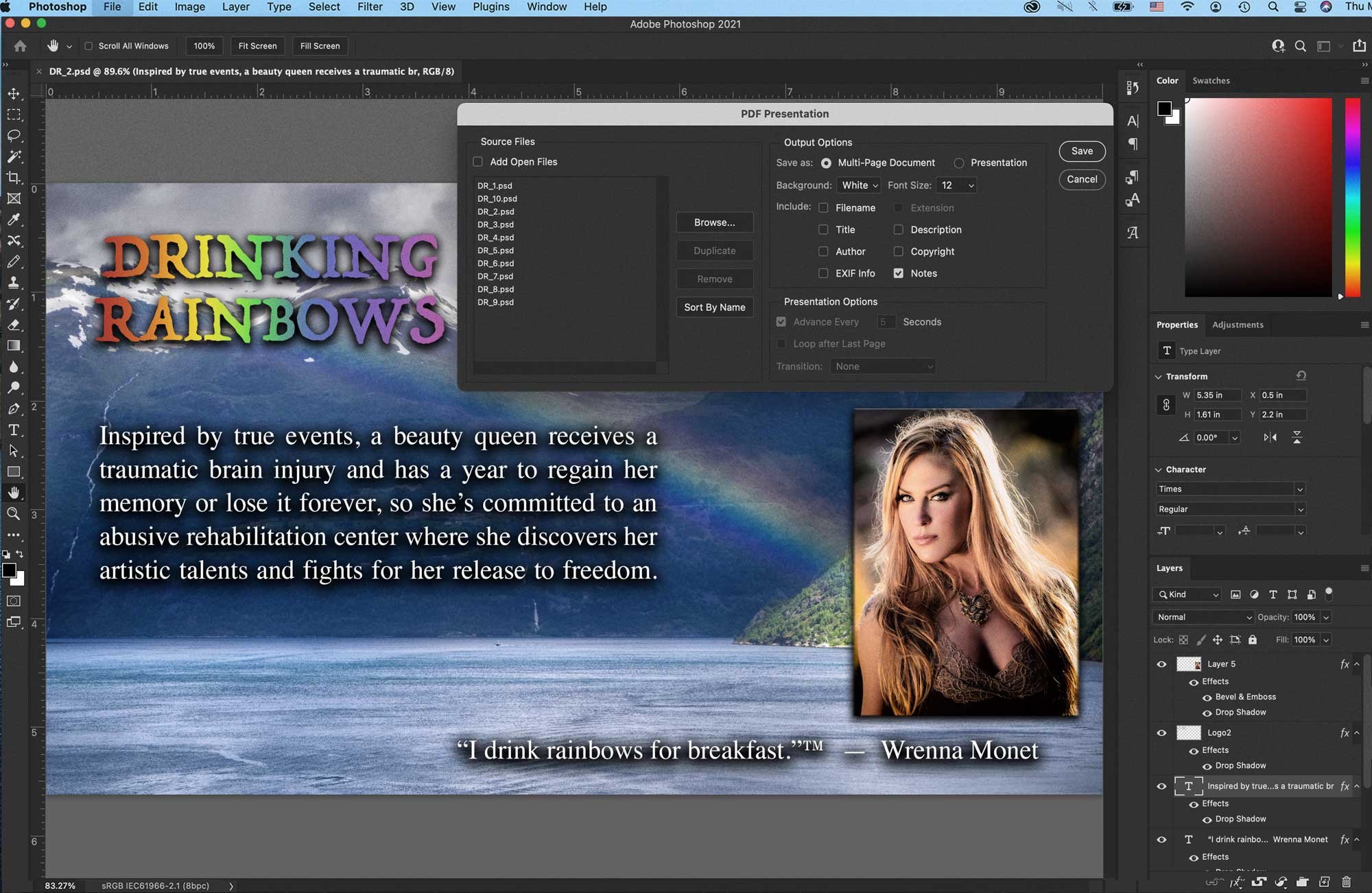
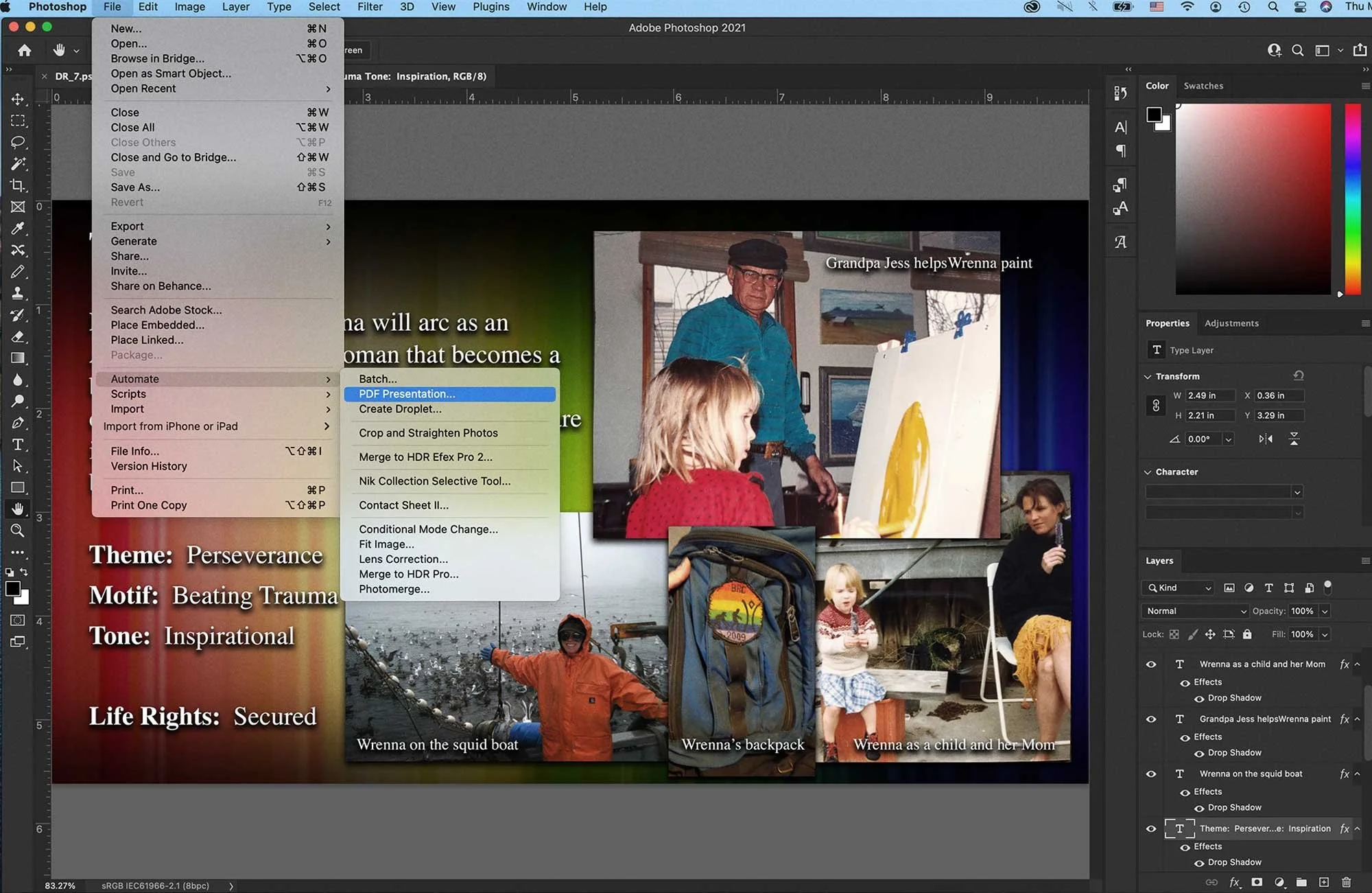
After you create your 5-10 pitch deck .psd slides in Photoshop, in the main menu go to: File >> Automate >> PDF Presentation, and then select your .psd files. Arrange them in the correct order, then click “save” – and Photoshop creates the high-resolution .pdf pitch deck, perfect for printing.
When it comes to producing a low-resolution version, make .jpgs from each .psd file at a lower resolution then repeat the same steps under File >> Automate >> PDF Presentation – and Photoshop will create a lower-resolution version. You’ll have to create all your completed pitch deck .psd files first and save them as master files you can edit in the future.
Pitch deck slides -
1. The title page
The first slide is the title page, and is self-explanatory. Like a PowerPoint presentation, your pitch deck is horizontal in format and your first slide is “on screen to hold the audience” until you begin your actual presentation. The first impression is everything whether you’re “in the room” in person or on zoom – so think of this title page slide as your movie poster.
There are also many royalty-free image websites and commercial photo sites and they too can all be found with a simple Google search.
2. Logline
Your second slide will also need an equally impressive background image, or images, plus your logline. As a design tip, use public domain iconic images you find via Google of similar-themed films to “set the mood” of your film – there are also many royalty-free image websites and commercial photo sites and they too can all be found with a simple Google search.
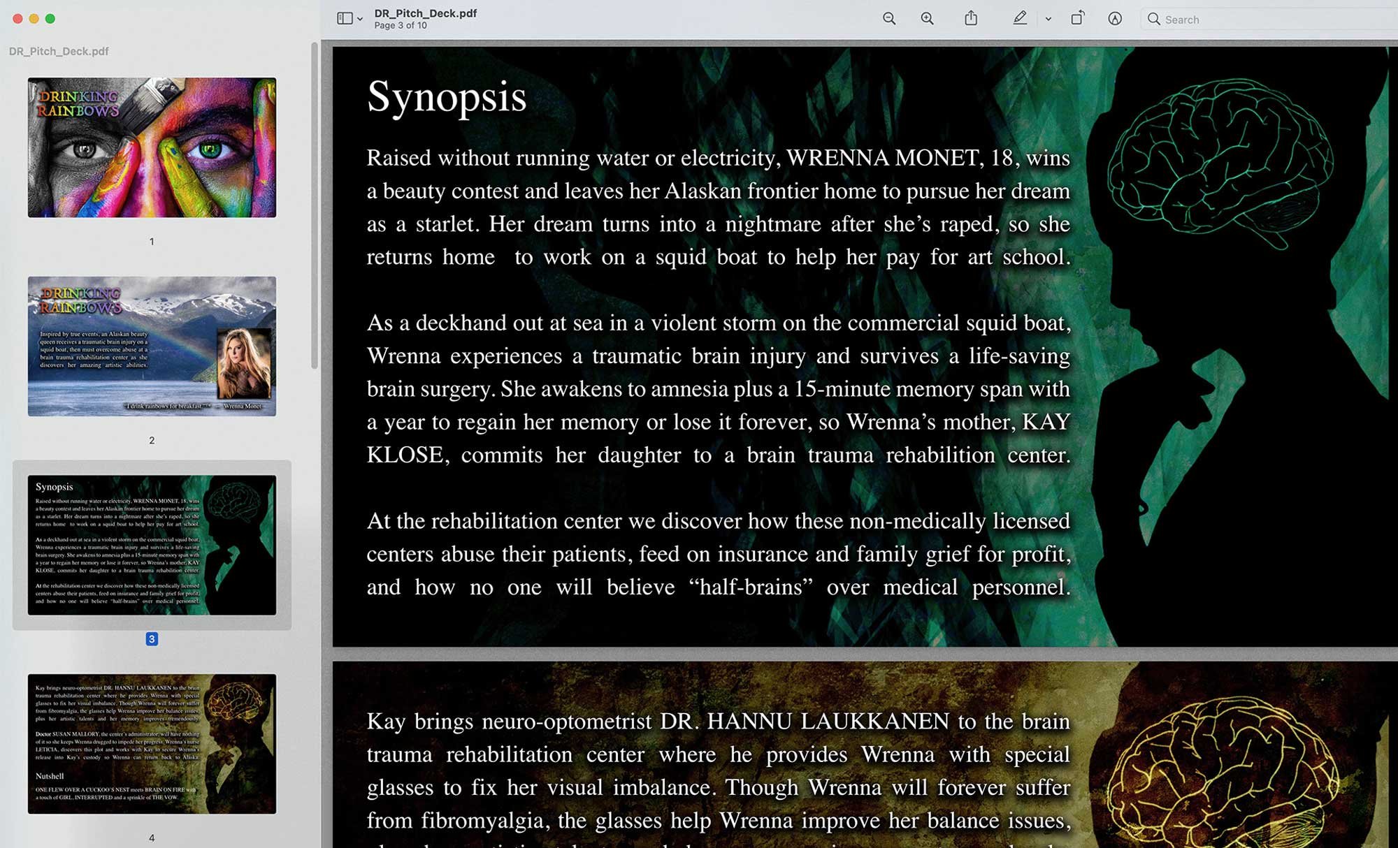
3. & 4. Synopsis & Nutshell
Slides three and four are great for your synopsis and should include a background image, or images, but make them subtle so your viewer focuses on the text. Use the word “synopsis” on slide three because slide four is a continuation slide and if you have room on slide four, include your “nutshell” too. More on that below. It’s important that you keep your synopsis to 225 words or less – it’s an elevator pitch to describe what your story is about.
5. Why this movie?
Slide five is about the importance of your film. What makes your film so special? Why would the audience need to see this film? Does it touch on social issues or issues in the news? What makes your film so powerful that the production company has to make it? I usually title this page, “Importance of film” and use a background image or images to reinforce the importance of the film.
6. Character and location imagery
The sixth slide is an optional slide that should include images relevant to characters and locations used in your feature script. For example, in one of my pitch decks I titled slide six, “Provocative inspirational female-led premium drama” and included “actual” images relevant to the film based on a true story.
7. About the film
The seventh pitch deck slide is “About the film” and should include the protagonist arc. Keep it simple – about 50 to 60 words total. If you didn’t place the “Nutshell” in slide four, then place it here. A nutshell sets the tone of your film – for example, Sicario meets John Wick (I just made that up, but that’d be a heck of a film). You also want to include the film’s “Theme” and “Motif” on this slide and a background image or images where you can that illustrates the above.
8. Comparisons
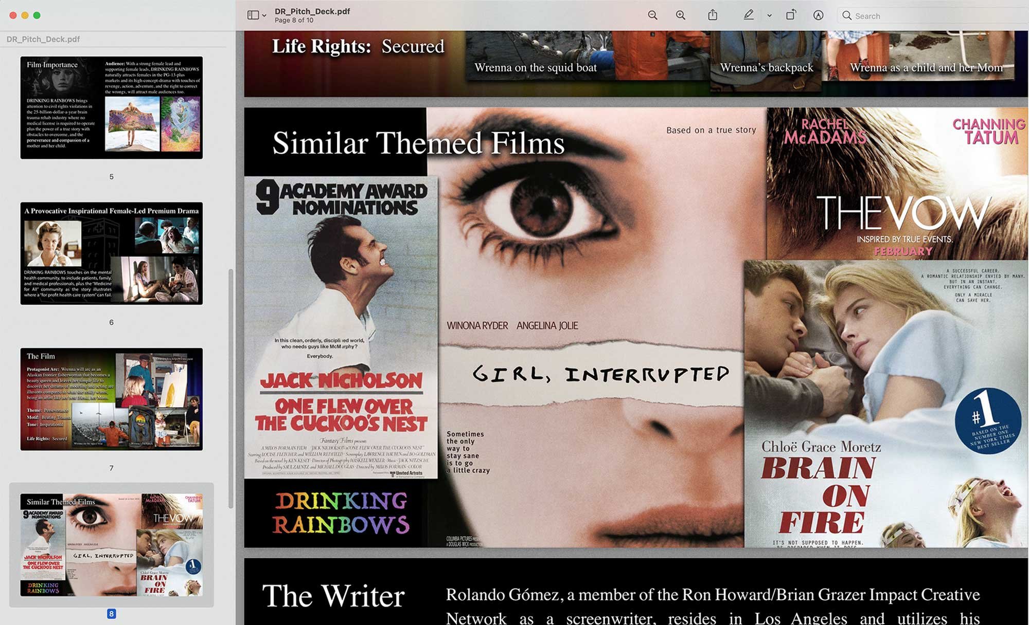
Slide eight is “Similar themes” and this is where you go and google original movie posters and make sure you include your “Nutshell” movie posters. Some movie posters are copyrighted, but if you can find the movie in Wikipedia, there’s a great chance you’ll find a public domain version. When you make this slide, make your images asymmetrical and get creative with your layout and design.
9. About you
On slide nine, it’s all about you. This is “The writer” bio slide and if you have anyone attached to your script, consider adding them here. Keep your bio at 140 words or less and include a photo of yourself, preferably not a selfie.
10. Tie back
The final slide, nothing goes here but a “tie back” image to your title slide – that’s an old journalism trick called a “tie back conclusion” that makes the reader, or viewer in this case, start from the beginning again. Full circle, not full stop.
The pitch deck framework that I’ve provided above should give you a solid visual platform to riff off and pitch your project when you get into the “room”.
Rolando Gómez
Rolando Gómez is a screenwriter, former U.S. Army combat photographer and fellow cohort in the Writer's Guild Foundation Veterans Writing Project. He’s also an Associate Producer for the Burbank Cinema Libre Studios’ feature I Am Gitmo.
You can connect with Rolando on Instagram, Facebook, and Twitter, contact him through his website, and find him on IMDb.
Get killer articles in your inbox.
Subscribe to Screenwriting Intelligence.


